Introducing the new M1 look


- The M1 design overhaul introduces improved accessibility, dark mode, streamlined workflows, and a cleaner interface.
- The update reflects a maturing company serving a user base that values a sleek, efficient platform for managing wealth.
- The update caps a year of expansion for M1, including significant growth in employee headcount and reaching $1 billion AUM.
When you opened your M1 app today, you may have noticed some changes: new colors, new workflows, and a smoother experience navigating through your account.
These changes are the result of a months-long project we undertook last summer to make the M1 app a better destination for experienced, engaged investors looking for a long-term home for their money.
So what exactly did we change? And why? Read on for a deep dive into the thinking behind the new M1.
The backdrop: a maturing company
Since we launched in 2016, a lot has changed at M1. In 2017, we introduced a completely free version of our flagship Invest product. In 2018, we added Borrow, our portfolio-backed line of credit. Last year, we launched a beta version of Spend, which offers an FDIC-insured checking account with high interest on deposits and a cash-back debit card to M1 Plus members.
For much of M1’s history, we navigated changes with a startup’s mentality, doing what needed to be done as the need arose. We were scrappy, agile, and creative – but we took a step back this summer to consider where we were and where we were heading.
And while our scrappiness and agility allowed us to ship updates quickly, it also meant that we weren’t always able to achieve the cohesion we wanted for the platform as a whole.
It meant that we sometimes had to make hard choices. Because our in-house team rarely had enough bandwidth for everything we wanted to do, we relied on freelancers to design some of our product screens. And while their work was stellar, the result of relying on external resources was that the larger M1 user experience was starting to feel scattered.
Last summer, we decided to address this issue. These conversations forced us to look at the app as a whole and to discuss as a complete team where we wanted it to go. With input from everyone involved in its building and design, we were better able to think holistically about how to create a more cohesive experience.
To do that, we’d have to unify the existing pieces of the M1 platform.
We’d have to rethink our codebase with our future growth in mind.
We’d have to overhaul our app to reflect the company we were evolving into.
It would be one of the biggest projects we’d undertaken as a design team, but we were up for it. We worked together as designers, developers, and marketers to develop processes and solutions that would get us where we wanted to be.
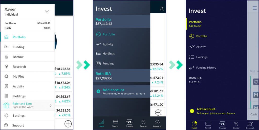
The new M1 look
During those conversations last summer, we agreed that we wanted to create an experience that made it easy for our customers to track and update their portfolios, manage their finances, and tap into the credit available to them. Today, we’re excited about the changes we’ve made, including the following.
Accessibility improvements
One of the first things we looked at was our color palette.
We knew it needed an update, in part to improve accessibility for users with color blindness and low color contrast. What had worked for us in our early years had now become too limiting. The teal we used didn’t have enough contrast with white, meaning it wasn’t a good choice for those with visual impairments.
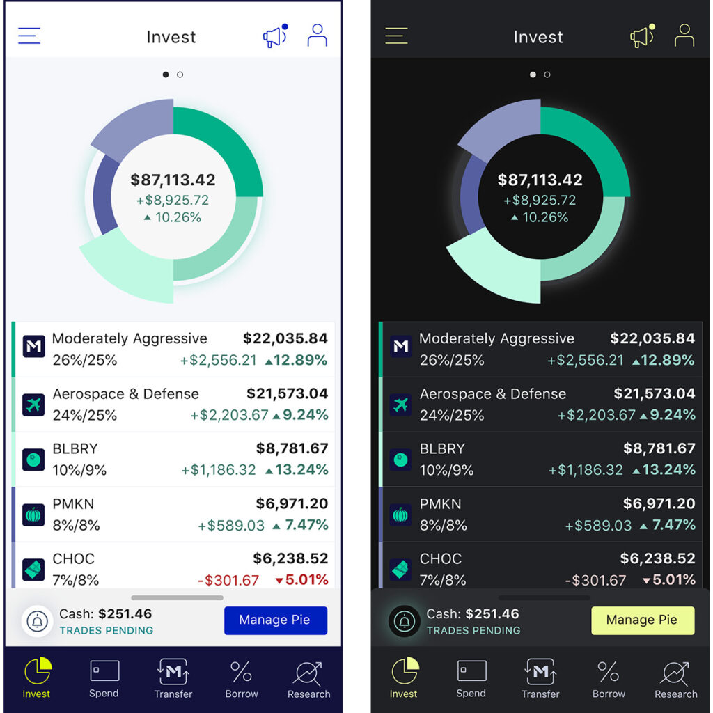
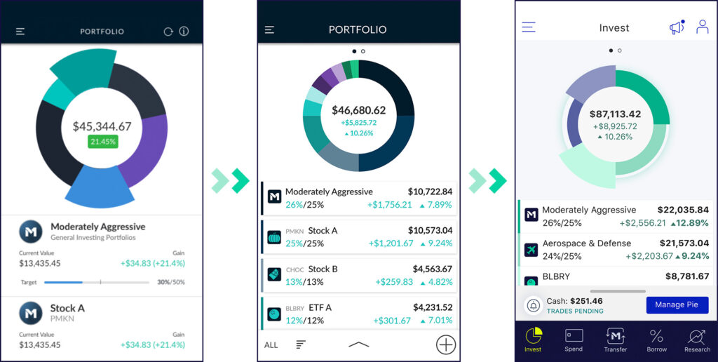
We tried dozens of palettes to see what felt the most like us. We wanted to bring energy into the brand through colors, but we knew we had to balance that with what was useful to customers. Here are some of the tests we did of various app screens to see what worked and what didn’t:
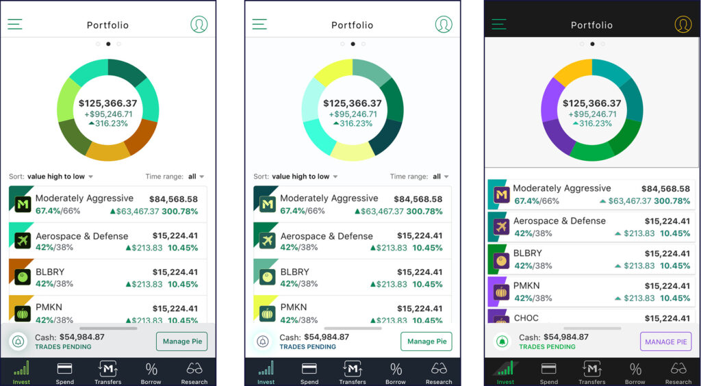
In addition to new colors, we also added a “dark mode” option, so that users could view the screen with a dark background and bright text and images. Dark mode can ease the eye strain and headaches some people get from looking at screens too long, so again, this helped improve usability for a greater portion of the population.
Streamlined workflows
When you grow a company one product at a time, the resulting workflows aren’t always as streamlined as they could be.
Invest, our first product, was designed in 2016, and over time we made improvements to design and functionality.
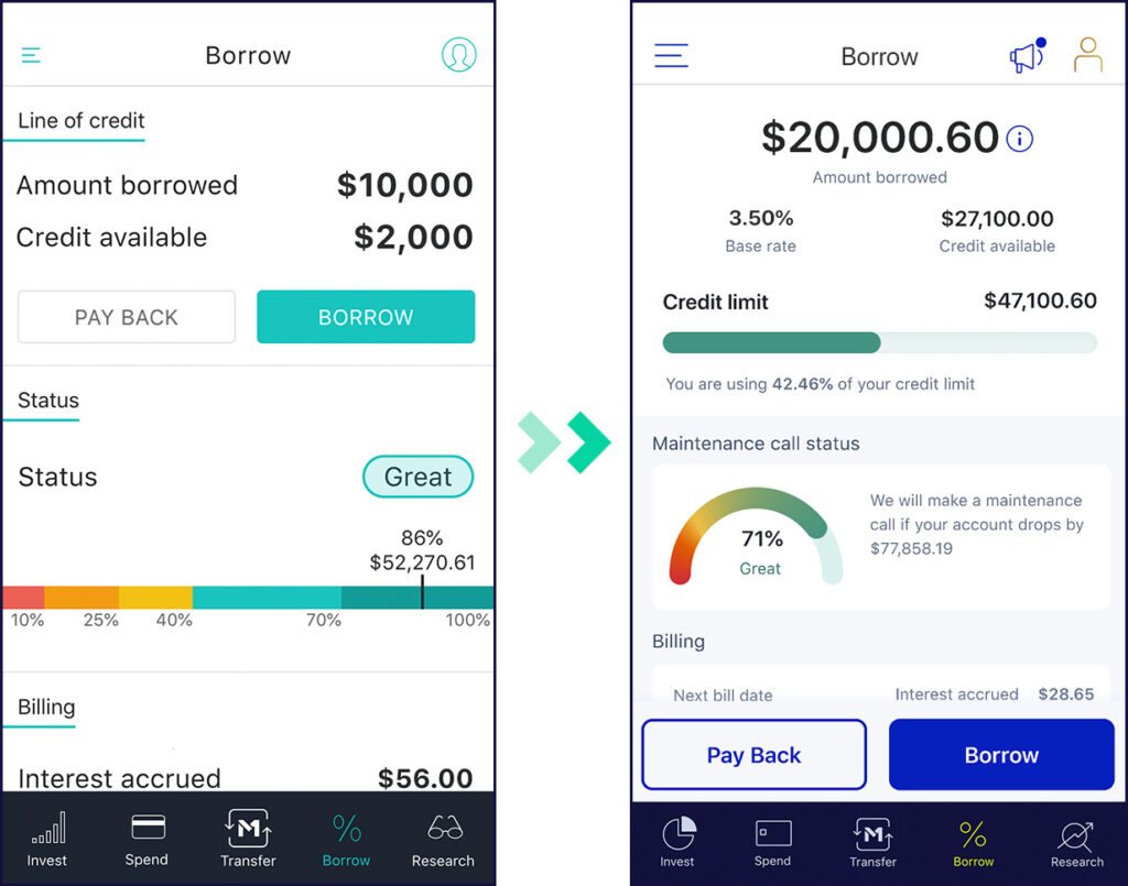
In 2018, we launched Borrow. We left it largely untouched after launch to focus on other improvements to the rest of M1.
Then, in 2019, we launched a beta version of Spend. At that point, we already knew we would be reviewing the app design as a whole, so its design was noticeably different from the other two products. While we didn’t know what exactly the new M1 would look like when Spend officially launched, we had a sense of the direction we were headed.
Last year, looking ahead to this visual overhaul, we also worked on improvements to the user experience to make moving from screen to screen easier and more intuitive. We added a bottom navigation bar and reworked the app menu, both of which made things easier to find within the app.
We also introduced a Transfers screen to enable seamless fund transfers among any M1 accounts. With the introduction of the Transfers function, all money transfers now go through one screen, making for a more unified experience.
Cleaner interface
As we laid ground rules that would give us room to grow, we established clear guidelines for what various colors would denote throughout the product. Our goal was both to create visual hierarchies so that information and action items were easier to find within screens and to establish “rules of the road” for how colors worked so that each color denoted the same thing every time it appeared.
Bright blue, for example, now means “this is clickable,” and chartreuse means “this is active.” We use green to show positive money movements and red to indicate negative money movements.
Beyond color, we also reexamined the illustrations and iconography within the app. We wanted illustrations to be simple enough that they didn’t compete with the screen or the product, but also clear enough that they helped explain processes better.
To this end, we reworked some of the icons along the bottom navigation bar to make it more intuitive.

For users, the high-level result of these changes is that information is easier to find throughout the app and it’s clearer what each button and menu item will yield.
Becoming the destination for intelligent investing
We’re here for people who are engaged with their investing journey and with managing their own finances. Our goal is to keep innovating to make it easier for you to grow and manage your wealth.
That’s why we like to think of the new M1 as the first truly investing-friendly app.
And we’d love to hear how you think we’ve done. Drop us a line at hello@m1finance.com or tweet us @M1Finance to let us know your thoughts on the new M1.
- Categories
- M1